Rule of Thirds in Photoshop & Illustrator
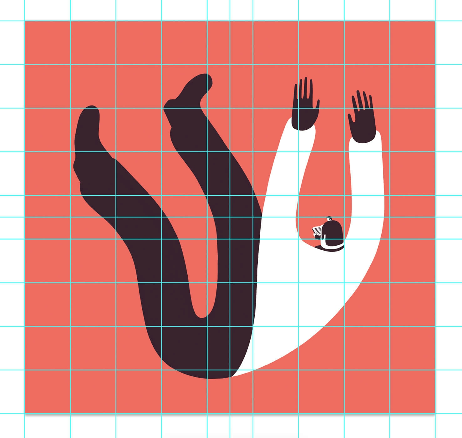
Using the rule of thirds in Photoshop & Illustrator is very helpful when composing an image and deciding to place the elements in the format.
The way you compose has a massive impact on the final result. A bad composition can ruin a good image and idea. It is as important as the color palette or the style.
Setting up guides is the first thing I do when I start working on a final illustration.
The guides give me certainty and direction. The elements and shapes aren’t floating around; they are placed, built and based on those powerful invisible lines.
The Rule of Thirds
The rule of thirds is a simplified version of the golden radio. It is based on Phi, a mathematical ratio, and has been used since antiquity, extensively by people like Leonardo Da Vinci, Dali, and Le Corbusier.
The rule of thirds involves dividing the composition into nine equal sectors using two vertical and two horizontal lines.
How I Use the Rule of Ninths, My Particular Version of the Rule of Thirds
The rule of thirds is very practical because you can use it unlimited times over the resulting sectors, getting as many divisions and guides as you need.
I use the rule of thirds twice, which creates 3 times more thirds. So, I call it The Rule of Ninths.
This is extremely helpful because:
- You end up with guides that allow you to define margins. For example, I rarely surpass the external sectors. I like to give space to the composition.
- The rule of thirds creates 4 attention points where you can place the most important element of the composition. If I have two important elements, I place them on diagonally opposed points.
- I use those guides as lines or shapes like the horizon line, or other vertical or horizontal reference lines in my illustrations.
Break the Rules
Some images require breaking those rules, and I don’t have any trouble doing it.
The guides are just for reference, and the nature of each image is distinct. Each composition should respond to each brief, as they produce different effects.
There are dozens of different composition diagrams. Rikard Rodin has a marvelous article about composition diagrams about it, where he analyzes the composition diagrams of more than 50 posters.
I highly recommend it!
GuideGuide
I create the guides based in the rule of thirds in one click. I use the awesome Photoshop & Illustration extension by Cameron McEfee called GuideGuide.
In addition to the rule of thirds’ guides, I like to add the vertical and horizontal midpoints guides. This is very useful to center elements. You can import my set of guides using this link in GuideGuide.
Paying attention to the composition has a huge impact on the final result.
Working with the rule of thirds and guides gives me direction. My steps are firm. But I trust my eye and my experience most. I break and ignore those rules when I need to. Every image is unique.
Join +10k readers. No spam ever.
