How I Use and Manage Color to Create My Illustrations
Minimalism is settled very deep in my work (and also in my life).
This is one of the reasons why I only use a few colors and I try to avoid strokes, lines, and gradients. In fact, the color is one of the most important elements of my work.
The way I use color has evolved since I started being an illustrator. Nowadays, I use a very specific workflow to choose my color palette. I will explain the process I follow and the tools I use in this article.
Colour database
We are surrounded by amazing colors. The world itself is an incredible color palette.
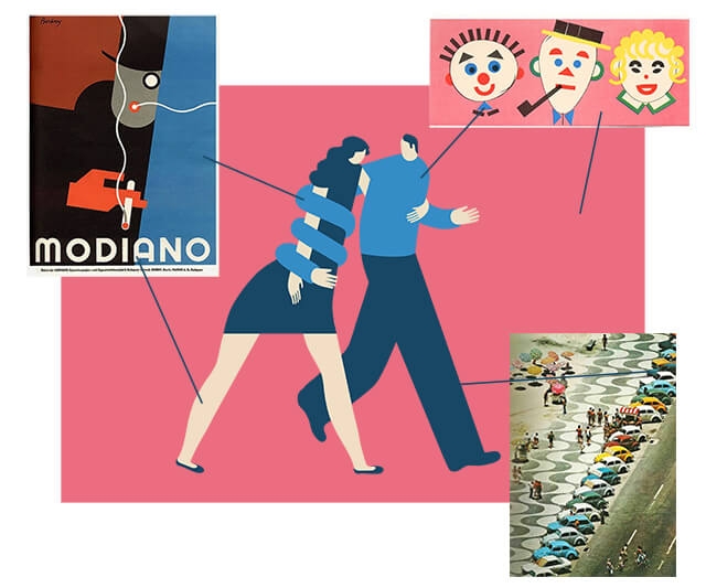
I keep a color database in Evernote with all the colors that call my attention. It includes photos, old images and work of other artists and illustrators.
My color database is huge, and with the years, it has become one of the most important tools in my working process.
I use it as a reference tool that inspires me and guides my color decisions.
Picking colors with Sip
Sip could be defined as the universal eyedropper of Photoshop that works anywhere outside of Photoshop.
I use it to catch any color inside of my screen (images, files, websites or anything else). Sip lives in the menu bar and it’s extremely easy to use. You can get the color hex value copied into your clipboard in a click, ready to be pasted in Photoshop or anywhere else.
You can also use Sip to organize your color palettes and some other extra advanced features (which I don’t use).
Sip is free and it’s available for Mac only.
Working process
- The number of colors
When I have the idea, and after creating the guides in Photoshop, I start thinking about the number of colors the illustration will need. I try to keep the number of colors as low as possible. - Picking guide colors from my color database with Sip
Then I go to my color database to find colors that may fit conceptually and formally with the illustration. When I find some of them, I use Sip to copy the color Hex value into the clipboard. - Creating new colors from the guide colors
When I’ve identified colors that can work and I have them into my clipboard, I go to Photoshop and I paste the hex color code to use it. I start playing with the first shapes of the sketch and adjusting the colors inside Photoshop. - Final colors
As the sketch evolves, the color palette evolves too. I adjust the tones till I find a strong color combination. - Extra: validating the colors when the sketch is finished
Sometimes when the sketch is finished, I play around with the colors, trying to find better solutions. This is very useful because my sketches are “unpolished finals” and the impact of the colors in the sketches is very similar than how they will look like in the final.
Conclusion
A good color palette has a massive impact on the final result of an illustration, especially when you have a minimalistic style and you don’t use a lot of colors. A poor or bad palette can destroy a good illustration.
I’ve ruined great ideas and illustrations because of a bad choice of colors. But luckily, over the years, I’ve found my workflow that helps me a lot to deal with colors.
Join +10k readers. No spam ever.